Tips for successful labeling
- Use appropriate colors, materials and fonts

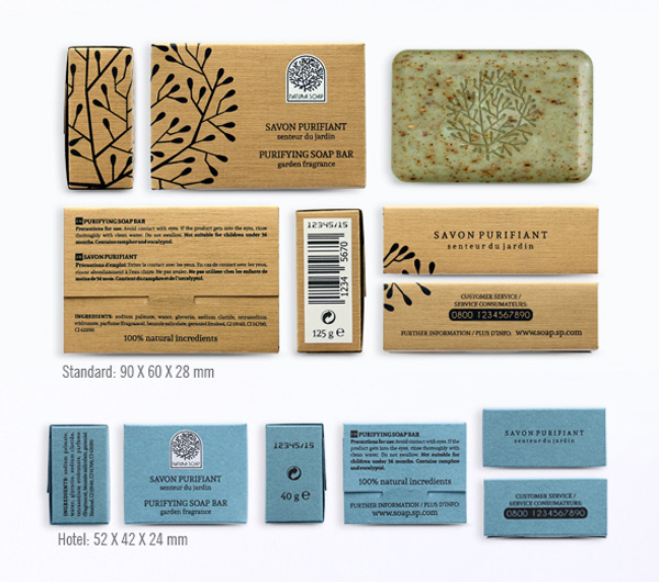
We need to be sure that we have chosen the appropriate color and font for the labeling so that the most important information regarding the product be clearly visible and readable. In general, white labels are preferred in white or transparent packaging as they make the product look more attractive and larger, brown labeling is ideal for organic products as they look earthy and give a sense of stability and credibility and blue labeling should be used in order to provide a sense of trust and power.
- Customize the size of the label
The label works as an alternative to packaging. For visually attractive products, you should use small labels. On the contrary, for bulky products that do not meet the aesthetic criteria you should use larger ones. Equally important is quality in printing and the materials used in labeling.
- Create a unique label
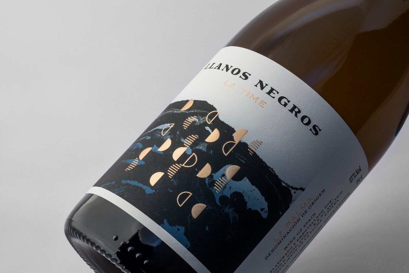 A label that stands out between similar products automatically makes the product itself more competitive, especially if it is fitted with proper lighting and presence on the shelf.
- Durability for packaging and label
Many packages are re-used for storage, so it is recommended that the labeling material and the packaging be environmentally friendly.
- Label info
The label should provide important information. Still the content should be as short and comprehensive as it can be. At the front side you should include the name, the logo or an identifiable symbol that makes it familiar as well as a brief description, if applicable. The list of the ingredients and the way of use are mandatory and should be placed on the back of the product.